A version of the list and combo box controls with enhanced features, including multi-line text, images, fonts, colors for individual entries;--also, tab-aligning and multiple rows for extended list box--and customizing the drop-down button, and mouse events and horizontal scrollbar of the drop-down list, of extended combo box
Last updated: February 2, 2023 2:30 PM EST
(NOTE: If you've ever downloaded this before August 24, 2021, 1:00 AM EST, then please read the the "WARNING!" section below. Also, if the graphical designer "refuses" to display a form with 1 or both of these controls, then please read the "Using This Library In A Host Project" section below.)
Introduction
ExtListBox and ExtComboBox inherit from the ListBox and ComboBox controls, respectively--and have the following extra features:
- Allows one to specify images to display before (or in place of) text for individual list items, as well as the ability to set the fonts and colors of the text and background of individual items
- Allows one to have multi-line text for a given list item (simply embed carriage-return/line-feed sequences in the item's text)
- Allows one to intelligently line up (tab-delimited) columns of list items (
ExtListBox only) with one command - Allows one to customize the text and background colors used for selected (highlighted) items
- Allows one to trap mouse events and have horizontal scrollbar for drop-down list of
ExtComboBox, and to customize the bitmap for its drop-down button - Allows one to track which item in
ExtListBox's caret is over, whether it's selected (highlighted) or not - Allows one to perform a binary search for a list item, based on its display string;
FindStringBinarySearch can be used on a sorted list in lieu of FindString and FindStringExact - Allows one to set up a list so that horizontal-scrolling extents and tab alignments are automatically adjusted as the list changes (NEW!)
- Allows text and and all graphical attributes of each item of a list's initial contents to be set up at design time if desired (NEW!)
Recent Changes
February 2, 2023 (Groundhog Day!):
The COMBOBOXINFO structure (within the ExtComboBox.ExtComboBoxNativeWindow nested class) is now a class.
February 1, 2023 2:30 PM (EST):
The ExtComboBox class no longer relies on the Win32 APIs SetWindowSubclass, RemoveWindowSubclass, and DefWindowProc to subclass the drop-down list; instead, it uses a nested Private class--ExtComboBoxNativeWindow, which inherits from NativeWindow--to handle the subclassing in a fully managed manner. The 4 mouse events for the drop-down list still function the same; all of the code that's key to getting the edit and drop-down window handles and translating message info into MouseEventArgs info has been transferred into the nested class, as well as the detection of the main handle for the control's being created/destroyed.
Also, I've fixed a bug in the demo program so that the mouse-status reporting procedure fires for all 4 DropDownMousexxxxx events (as it should), not just DropDownMouseMove. The bug occurred when I removed, then re-added the control on the form but neglected to include all 4 events in the re-constituted Handles clause as before!
September 24, 1:50 PM (EST):
I've fixed a spelling error that caused the ExtComboBox property DropDownButtonRectangle to be DropDownButtonRectange (!!) instead. If your code already uses the misspelled property, then add the "'l" to it wherever it's used opon downloading the corrected DLL.
September 13, 2002:
I have now--finally!--added a property page to allow a programmer to populate the list of either control at design-time!!! I have also modified the AlignTabs method of ExtListBox.IntegerCollection so that it can either use the minimum necessary tab widths for each column (including inter-column spacing), or simply expand the tabs when they're not wide enough for certain columns (previous behavior). I have also modified ExtListBox.HorizontalExtent and ExtComboBox.DropDownHorizontalExtent so that, when set to -1 (no longer a transient value), the horizontal extent used for horizontal scroll bars is automatically adjusted when the list is modified, and added an ExtListBox.SpacingBetweenColumns property to allow tab alignment to be automatically adjusted when the list is modified. Additionally, ItemHeight throws an exception, even at run-time, when set to a value outside of 0-255, and ExtComboBox.IndexFromDropDownPoint has an additional optional parameter (on both overloads) to specify whether or not to auto-scroll the drop-down list to the specified co-ordinates. Finally, I have corrected some errors in the item-rendering and tab-aligning processes as well as added a serious of constructors to the various collection classes.
April 12, 2022, 2:49 PM EST (very important!):
I've fixed a bug in ExtListBox's ItemHeight property that keeps the control from reflecting a new value after setting it to one (while still setting the item-height behind the scenes). For both controls, see the new description of the property and the note about when to set it.
December 28, 2021:
I've fixed a bug in the protected OnCaretIndexChanged method declaration so that it is now overridable.
December 25, 2021 (Merry Christmas!!!), 5:30 PM EST:
The hidden ItemInfo property DisplayString and the public method ToString of the ItemInfo class both return the ultimate display-text string for a list item, unless an ItemInfo instance is not retreived from an actual list (i.e., is instantiated explicitly by the host program), in which case it's simply Value.ToString.
December 22, 2021, 4:50 PM EST:
I added the method FindStringBinarySearch to both controls, allowing a pre-sorted list to be searched for a fully- or partially-matching display string using a binary search; useful on very large lists. I also took care of some potential rare error situations. In particular, the "hidden" DisplayString property of ItemInfo always resolves, as much as possible, the ultimate display text for the object, and the ExtSupportModule procedures which resolve the information for DisplayMember and ValueMember properties resolve case where the requested properties have declaration ambiguities or don't exist.
If the property specified by DisplayMember or ValueMember doesn't exist for a list object, then the control behaves as if no property is specified--returning the whole object's ToString value or the whole object itself, respectively. If the property Shadows a base-class version, then it relies on the derived-class version. If there are 2 or more overloads for a specified property even after accounting for any shadowing, then the controls behave as if no property is specified (returning default info). (In no case will an exception be thrown for the host program as a result of a requested property being ambiguious or non-existant.)
October 17, 2021 (very important!):
I fixed a bug which would cause the controls to crash when no images are present and ImageSize isn't set to Size.Empty.
August 24, 2021, 1:00 AM EST (very important!):
I've fixed a possible file-and-folders glitch that might--might--have you relying on an antiquated DLL which doesn't support the last features. (See "WARNING!" section in order to fix it if you've downloaded this prior to August 24, 2021, 1:00 EST!) Also, the SelectedItemInfo property in both controls is no longer read-only. (That was a bug on my part!) Setting it to an ItemInfo instance will, if the ItemValue.Value object is in the list, select that entry and set the image, font, and color attributes to the instance you've supplied.
August 20, 2021:
I fixed a bug in the demo program which would cause a tooltip not to display when the mouse is over the bottom-most item in a combo box which doesn't have a horizontal scroll bar. (See ShowExtComboBoxTooltip code sample at end of article for modifications.)
June 23, 2021:
A little update to the demo program--it now shows how to have a tooltip over items in the drop-down list of ExtComboBox!! The procedure ShowExtComboBoxTooltip in the demo handles everything. Note that if the coordinates--relative either to the edit portion or the drop-down box--are omitted, the most recent ones are used. If AreForcingRedraw is included and True, then the tooltip is redrawn even if the mouse and the selection haven't moved; otherwise, the tooltip is only redrawn when the mouse position or selected index changes. The demo also has a tooltip for ExtListBox, indicating the current caret index. Note that the list-box uses the ToolTip's SetToolTip method (standard procedure), whereas the combo-box must rely on the Show method (shows for the default 5 seconds)!
June 3, 2021:
Incorporated exception-handling into ExtComboBox's auxiliary-handle subclasser in order to ensure that default message-handling occurs even when a "DropDown" event procedure doesn't handle an exception; also, made the focus-rectangle-drawing logic more efficient.
May 22, 2021:
I have corrected a bug that causes the control, whenever DropDownStyle is ComboBoxStyle.Simple, to crash when reading DefaultDropDownButton and possibly mis-display when setting CustomDropDownButton. (See updated description of members below.)
May 20, 2021, 9:49 PM EST:
I have updated the code for the SelectedValue property of both controls so that the SelectedValueChanged event fires under the right circumstances. Also, the ExtListBox control now contains a CaretIndex property and CaretIndexChanged event for tracking the item where the list-box caret is located; useful when SelectionMode is MultiSimple or MultiExtended. Finally, I corrected the logic in the DrawImageAndText method of the ExtSupportModule module so that the item currently under the caret of a control has a proper focus rectangle.
May 5, 2021:
I have used Win32/SetWindowSubclass (now a nested NativeWindow-derived class--see above) and WndProc subclassing to allow one to track mouse events for the drop-down list of ExtComboBox (DropDownMouseMove, DropDownMouseDown, DropDownMouseUp, and DropDownMouseWheel)--along with properties and methods to exploit the information supplied by them,--to enable a horizontal scrollbar for the list (DropDownHorizontalScrollbar/DropDownHorizontalExtent), and to allow replacing the default drop-down button with a custom bitmap. Subclassing the drop-down list is a tricky thing, requiring "unmanaged" Win32 APIs, since the list uses a different, not-directly-exposed, handle than the overall control uses. I've also exposed the drop-down and edit-portion handles, in case one wishes to do additional extensions with Win32 and subclassing. Many of these new properties, methods, and events might not be used very often, but they can come in handy--paticularly being able to track the mouse on the drop-down list. Note that all custom members pertaining specifically to the drop-down list have "DropDown" inside their names.
December 19, 2020:
I fixed some errors involving properties and functions without type specification (without an "As type" clause at the end of the declaration, causing some to be erroneously defined as Object type), and some involving implicit type conversions. Therefore, the class library will properly compile with Option Strict turned on (as it is now); if you've been using these controls in a host application that's compiled with Option Strict and been getting compile-time errors regarding type conversions, this should fix these issues!!!
December 17, 2020 (documentation fix):
Not a feature change or bug fix; however--I errorneously said that DataSource was not available at design-time. It actually is.
December 14, 2020:
A new property, AlignText, allows one to align the start of the text portion of items to start after the widest image when image size isn't fixed (that is, when ImageSize = Size.Empty).
December 10, 2020:
Previously, the controls were not designed to be "data-aware"; now, the DataSource, DisplayMember, and ValueMember properties are supported, as well as a new method, SetDataSource, which allows one to specify graphical information with the data source. There are differences, however, for how the properties are implemented in the extended controls vs. the base-class controls. MyBase's DataSource info is different than that of the derived controls, and the DisplayMember and ValueMember properties are not used at all with MyBase. As is the case with the base-class controls, the host program cannot insert, remove, or modify data in the list when DataSource is not Nothing; however--unlike with the base controls--it can modify the graphical info for list items, and even set the Sorted and/or DisplayMember properties in order to alter the order of items displayed and returned by the Items collection while DataSource isn't Nothing. The ordering of items returned by referencing the DataSource property, however, is not affected--so a program shouldn't rely solely on integer indexes in order to match up list items with data-source items. Data-binding using the BindingContext and DataBinding properties is still not supported, however; and both properties are overridden/shadowed as read-only properties that return Nothing.
Finally, it's now possible to set the background color of list items as well as image, font, and text-color; and it's possible to change what text/background colors are used for highlighted items. Also, the DrawItem and MeasureItem events are no longer "ignored" (suppressed) from the standpoint of a "host program"; however, any "default" drawing or measuring specific to these controls is always done before the host program gets to use a given one of these events for additional display formatting.
Using the Code
Regarding Specifying Graphical Information When Filling Lists
Many members of ExtListBox, ExtComboBox, and their ObjectCollection classes support overloads which allow the host program to specify images, fonts, textcolors, and backgroundcolors information for items being added/assigned to the list. Each parameter is individually optional, and defaults to the parent controls' DefaultImage, Font, ForeColor, or BackColor property, respectively. Each parameter, when specified, can be either in the form of a scalar instance of Image, Font, Color, or Color--in which case, the same graphic info of the given type applies to all specified list-items--or in the form of an array thereof--in which case different graphic info is assigned to each specified list-item. In the latter case, the array is auto-resized to match the number of items being added/assigned, with items corresponding to array elements that were missing or Nothing being given the aforementioned default value. (The array elements must be in the same order as the list-items would be enumerated, index-wise.)
Note that arrays can only be specified with members for adding/assigning a range of items, like Items.AddRange or SetDataSource--not with members for adding a single item, like Items.Add or Items.Insert--as it makes little sense to assign multiple images/fonts/colors to a single item. Finally, there are overloads for using ItemInfo-type instances or arrays/collections in order to have graphic info pre-specified before invoking a member--thus avoiding using the extra parameters or defaulting.
Using Members When A Variable/Parameter Is Of Base-/Ancestor-Class Type
Since the controls and their related classes override and/or shadow many base-class members--with very different functionality from that of MyBase versions--one should be very careful when assigning instances of these classes to variables/parameters typed as base or ancestor classes. The best thing to do is to first cast the variable/parameter (using CType or DirectCast) to the derived version before invoking a member that may be overridden or shadowed--lest the base-class version get invoked instead, with adverse results. For example:
Public Function GetDisplayMember(lb As ListBox) As String
'   get DisplayMember value for list box
If TypeOf lb Is ExtListBox Then
   '   extended control
   Return _
      DirectCast(lb, ExtListBox).DisplayMember
 Else
   '   regular control
   Return lb.DisplayMember
End If
End Function
Using This Library In A Host Project (please read!)
I have now added a propery page/editor to allow a programmer to set and modify a list's initial contents at design time--a previously unavailable feature that was present in both controls' base classes. However, since I don't know how to write "code that generates code", the feature is implemented differently than in the base classes, relying on a "proxy property" (InitialListItems), which appears in the Properties window as "Items" (which is what it modifies), and can only be set at run-time on an empty list (i.e., in a form's InitializeComponents method). Because of the nature of the class type for this property (don't know why it's an issue), you may have issues when trying to switch to a (pre-existing) project/solution using these controls from another one while in Visual Studio.
You shouldn't have a problem when the project/solution you're targeting is brand-new (created from scratch), pre-existing and the very first being loaded in a given sesssion of VS, or pre-existing but not yet with either of these controls on any forms. If, however, you're switching from one project/solution to a pre-existing one that already has these controls on 1 or more forms, then you can't just close the first project/solution and open the one with these controls; instead you must completely exit VS, then start it up again and load the target project/solution. Otherwise, any forms using either control won't successfully display in the graphical designer! If you plan to add a pre-existing project which uses these controls to a (pre-existing) solution which doesn't yet, then add the project to the solution, save the solution, exit VS (entirely), then re-start it and load the amended solution.
Sorry for any inconvenience.
Customizing These Controls (please read!)
If you wish to customize this class library, you shouldn't have problems unless you make any changes to the property-page form (frmListCollection) or any of its controls using the graphical designer. In such a case, you must do the following after any changes thereto: Open the form's resource file (ListCollection.resx), and, under the category "Other", remove the row for "elbList.InitialListItems" (respond "Yes" to the resulting warning); then open its designer code file (ListCollection.Designer.vb), and remove or comment out the line starting with "elbList.InitialListItems = ". Otherwise, the library project won't build! It all has to do with the fact that the form uses 1 of the 2 controls being defined in the very same library.
Custom Members Of ExtListBox and ExtComboBox Controls
ExtListBox and ExtComboBox inherit from ListBox and ComboBox, respectively. Below are properties, methods, and events that are either unique to these controls, or have functionality different from their base classes.
* = member not available in base-class control
† = property not available at design-time
Properties
CaretIndex *† (ExtListBox only) -- gets or sets which item the list-box caret is on, regardless of whether the item is selected (highlighted) or not. Useful when multi-selection is allowed. Reading this property returns the index of the currently selected item if SelectionMode is SelectionMode.One and SelectedIndex isn't -1;--otherwise, the SendMessage Win32 API is used to get the current (possibly-unselected) caret index (0 is returned if no item has the focus). Writing to this property also selects the item with the specified index (if not -1), or deselects all items (if -1), if SelectionMode is SelectionMode.One (and list isn't empty);--otherwise, the SendMessage API is used to set the caret to the specified index without affecting any selection(s), Whenever the control has no items, or lacks a handle when SelectionMode isn't SelectionMode.One, -1 is returned when getting, and no action is taken on setting.Items -- specifies list items, including graphical information. Note that this is of type ExtListBox.ObjectCollection or ExtComboBox.ObjectCollection, not their base types. To set the contents of the list at design-time (NEW!), see the InitialListItems property and the topic below regarding the corresponding property page.SelectedItems † and SelectedIndices † (ExtListBox only) -- specifies selected items (including graphical information) and their indices, respectively. Note that these are of type ExtListBox.SelectedOnjectCollection and ExtListBox.SelectedIndexCollection, not their base types.DrawMode -- specifies where one is to have a fixed or variable vertical item-height, based on ExtListAndCombo.DrawMode enumeration value. (The control is always configured as "owner-draw" to allow graphic manipulation, since the control does its own custom imaging. If you attempt to set DrawMode to DrawMode.Normal, an exception is thrown.)DisplayMode * -- specifies whether to display text only, images only, or both (image to left, text to right) based on ExtListAndCombo.DisplayMode enumeration value.AlignText * -- specifies whether to horizontally align text part of items to begin after right end of widest image in list, even if image size isn't fixed (ImageSize = Size.Empty). True is the default value; if set to False, then the horizontal start of item-text may vary with image with, as text for each item then begins after right end of item's specific associated image.ImageSize * and ImagePadding * -- determine Size and Padding, respectively, of images displayed; defaults to a square image with 1 pixel of padding all round, sized using initial ItemHeight property value (minus padding). If ImageSize is set to Size.Empty (0,0), then images won't be scaled to match ImageSize: In such a scenario, if DrawMode property is ExtListAndCombo.DrawMode.UseFixedHeight, then they'll be scaled so that their height matches current ItemHeight property value (minus padding; aspect ratio is preserved); if DrawMode property is ExtListAndCombo.DrawMode.UseVariableHeight, then they won't be scaled at all. (The latter is useful for when images are of different sizes; use AlignText to determine whether left end of item text lines up for all items.) Whenever the ItemHeight value is changed during design-time (by setting it in the Properties window or resizing the control), the 2 properties are re-set to use padding of 1 pixel all aroung, and square ItemHeight-minus-padding sizing. (This behavior does not happen when changing ItemHeight at run-time.)ItemHeight -- gets the height of the first item; sets the height of items when Drawmode is ExtListAndCombo.DrawMode.UseFixedHeight, or of the next item added when it's ExtListAndCombo.DrawMode.UseVariableHeight. When set at design-time, sets ImageSize and ImagePadding as mentioned above. NOTE: When setting this value, you should do so before changing graphics attributes of items, since, for some unknown reason, setting it resets the fonts of all items to the main Font property! It's also preferable, at least for the ExtListBox control, to set it while the list is empty, because doing so on a populated list can cause the control's Height to contract (also an issue with the base-class control!).DefaultImage * -- specifies Image to display when none is specified for a list-item; defaults to no image.SelectedItemInfo *† -- gets or sets full information (including image/font/color) about the selected list item, as an ItemInfo instance. Setting this property will, if an entry matching the instance's Value property exists, select the entry and set the image, font, and color attributes according to the new instance.DisplayMember -- specifies which (sub-)member of a list-item's data object (ItemInfo.Value) are used for display in the list; if set to null (default) or a non-existant member, then value of object's ToString method is displayed. Unlike the base-class version, this property can be set even when DataSource is not Nothing, and, if Sorted property's value is True, affects the order in which items are sorted on the display and in the Items collection (but not the DataSource property itself). ValueMember -- specifies which (sub-)member of a list-item's data object is returned by the SelectedValue property; if set to null (default) or a non-existant member, then the value the object's ToString method is returned by SelectedValue. Unlike the base-class version, this property can be set even when DataSource isn't Nothing.Sorted -- determines whether list is auto-sort as items are added, removed, or modified; when set to True, list is sorted on the spot. The sort order depends on the value of the DisplayMember property and whether the Format event is used (to specify a custom string for an item). Unlike the base-class version, this property can be set even when DataSource isn't set to Nothing; re-sorting the display/Items list does not affect the order of items in the DataSource reference, however.HighlightTextColor * and HighlightBackColor * -- specifies what colors to assign to text and background, respectively, for highlighted items. (Useful when the standard "highlight" colors are used for un-highlighted items.)DataSource -- retrieves, or assigns to or inserts into list, items from a data-source using default graphic infoHorizontalExtent (ExtListBox only) (behavior NEW!) -- modified to allow one to automatically determine the width of the widest item in the list, and set the extent accordingly, by setting it to -1--in which case any additon, deletion, or modification of list items causes the value to be recalculated and reset to reflect the new widest item. The AlignTabs method of ExtListBox.IntegerCollection now sets this property to -1 in order to intelligently set the extent. (The old way failed to take into account changes I've made to the sizing options for images.) Also available at design time now (also NEW!).DropDownHorizontalScrollbar * and DropDownHorizontalExtent * (ExtComboBox only) (behavior NEW!)-- identical in functionality to HorizontalScrollbar / HorizontalExtent, respectively, for ExtListBox, except that they are used to implement horizontal-scrollbar functionality for the drop-down list of ExtComboBox. As with the list-box control, the second property is only meaningful when the first is True (to allow a horizontal scrollbar), and setting it to -1 causes the control to set it to the extent of the widest item, with that extent re-evaluated when any changes are made to the list. DropDownHorizotnalExtent is alos available at design time now (also NEW!).CustomDropDownButton * (ExtComboBox only) -- specifies a Bitmap for the ExtComboBox's drop-down button (Nothing indicates the default image is being used); allows one to set the image to a custom bitamp. Note that the image is not stored scaled to the button size (DropDownButtonSize) for reading/wrting this property, but is scaled to fit whenever it is rendered (this prevents any erosion of image precision if the control is repeatedly resized, say, at design-time); also, unlike the default image, the background color of a custom button doesn't change depending on whether the list is dropped down or not. (Therefore, to revert to the standard button after using a custom one, set this property to Nothing instead of DefaultDropDownButton; otherwise, you'll just get a new custom image that's a copy of the current default one, and won't change appearance depending on the button's state!) A custom drop-down button, just like the default one, will only render whenever the list is designed to "drop down"; that is, whenever the DropDownStyle isn't ComboBoxStyle.Simple.DefaultDropDownButton *† (ExtComboBox only) -- gets a Bitmap for the combo-box control's current "default drop-down" button--the exact bitmap depends on the drop-down style and the button's state. This property only returns a meaningful value when the control has a handle, and reading when using a custom button may cause a momentary flicker as the default button is temporarily restored so it can be reading into a bitmap. This property exists primarily to allow you to use the default image as a drawing template for creating a custom one. Returns Nothing whenever DropDownStyle is ComboBoxStyle.Simple, as a combo-box of that style doesn't "drop down".DropDownHandle *† and EditHandle *† (ExtComboBox only) -- return the handles for the drop-down list and edit portion, respectively, of the combo-box; not the same as the Handle property, which is for the overall control. These handles only have meaningful values when the overall handle exists, and are supported specifically in case you want to create your own special functionality for these parts of the control.BindingContext and DataBinding -- Shadowed read-only properties that return Nothing. Use DataSource property or SetDataSource method to make control data-aware instead!SpacingBetweenColumns * (ExtListBox only) (NEW!) -- causes the ExtListBox.IntegerCollection's AlignTabs method to be called every time the list's contents are changed so that all tabs are wide enough for the widest items in each column plus the number of pixels specified by this property. Set to -1 to disable auto-realignment.InitialListItems * (NEW!) -- "proxy property" to allow a list's initial contents to be set at design-time! It displays in the Properties window as "Items" (the property whose contents it sets), and can be set any number of times at design time. At run time, however, it can only be set when the list is empty. The only time you'd ever want to set it in non-designer-generated code is when you're creating the control dynamically at run-time (otherwise the form's InitializeComponents method will set it)--and in such a case, it's simpler just to use the Items property to populate it. See below for the topic on the property page and ItemInfoCollection class. (BTW, simply manipulating an instance of the class won't populate the list; the instance must be assigned to this property. And the property's deliberately set up so that Intellisense does not suggest it in the code editor; it's still there, though--and including it in code won't cause a compiler error.)
Methods
SetDataSource(datasource[, images][, fonts][, textcolors][, backgroundcolors]) * -- sets DataSource property and assigns specific graphical information to items in the data-source.DropDownRectangle[(displayrectangle)] * and DropDownSize[(displaysize)] * (ExtComboBox only) -- retrieve the Rectangle and Size, respectively, for the combo-box drop-down list--in screen/full coordinates/dimensions if the optional parameter is included and True; otherwise just the client area coordinates/dimensions.DropDownPointToScreen(point) * and DropDownPointToClient(point) * (ExtComboBox only) -- make client-to-screen and screen-to-client conversions, respectively, for a point on the combo box's drop-down list.IndexFromDropDownPoint(point[, autoscroll]) * / IndexFromDropDownPoint(x, y[, autoscroll]) * (ExtComboBox only) -- identical to the IndexFromPoint method of the list-box control, except that it gets the index of an item under the drop-down list client-coordinate point. A value of -1 indicates that the point is not on the list's client area. If autoscroll (parameter NEW!) is True (default), then the drop-down list automatically scrolls as needed to display the point in question.DropDownButtonRectangle * and DropDownButtonSize * (ExtComboBox only) -- retrieve Rectangle and Size, respectively, in client coordinates, of the drop-down button; these properties are only meaningful when the control has a handle.FindStringBinarySearch(searchstring[, exact]) * -- locates the first entry in the list whose display string is a (case-insensitve) full match (exact = True or omitted) or a partial match (exact = False; entry must begin with searchstring) of specified searchstring, provided the display strings are sorted in ascending lexographical order (either by setting Sorted to True or manually sorting the list). If a match is found, then the index for the very first match is returned. If no match exists, then a negative value that is a 1's complement of the index of first entry whose display string follows searchstring lexographically is returned (use "Xor -1" to get the index); if the 1's complement of the returned value is greater than or equal to the size of the list, then all list items' display strings lexographically precede searchstring. (In any case of a non-match, the index corresponds to the correct insertion point at which to add searchstring while keeping the list sorted.) Do not use this method in a procedure handling a Format event, as not all display strings will necessarily be set to their proper values at that time.GetItemText(item) -- returns the display string for the specified list-object item; this method-implementation differs from the base-class in that the string reflects the final display text for the item after any Format events are processed, provided one doesn't read it from within a procedure handling such an event. The text returns represents the very first matching object-item in the list; an exception is thrown if there is no such item.
Events
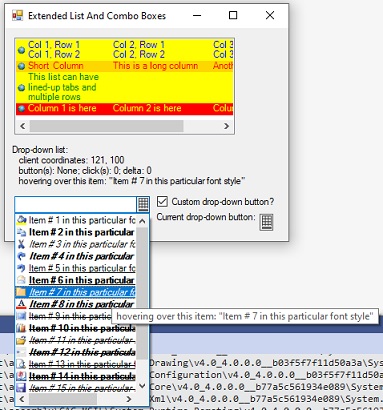
CaretIndexChanged * (ExtListBox only) -- Occurs when index of item under list-box caret (CaretIndex property) changes; is fired after SelectedIndexChanged eventDopDownMouseMove *, DropDownMouseDown *, DropDownMouseUp *, and DropDownMouseWheel * (ExtComboBox only) -- Track mouse action on the drop-down list of the combo-box control whenever the list is dropped down. They take the same parameters as their regular mouse-event counterparts--with a MouseEventArgs value as the second parameter--except that the coordinates are relative to the upper-left corner of the the drop-down list's client area (as opposed to the the edit portion's), e.Clicks returns the number of clicks whenever the list is dropped down since the control's creation, and e.Delta is only meaningful for the DropDownMouseWheel event. These events fire in response to mouse activity when the list is dropped down--even when outside the client area of the list (use DropDownRectangle(False).Contains on the coordinates to see if they're inside the client area)--and fire before any "standard" combo-box mouse-driven behavior. Also, they augment but don't prevent the standard behavior--which is why I didn't create "click" and "double-click" events for the drop-down list. Note that these events only apply to the list, not the edit portion, regardless of whether DropDownStyle makes the list "drop-down" (ComboBoxStyle.DropDown or ComboBoxStyle.DropDownList) or "always-present" (ComboBoxStyle.Simple).
Custom Members of Auxiliary Classes
ItemInfo Class
An instance of this class contains the object, and the graphical information associated with it, of a list item or potential list item. Its Public members are as follows:
Value -- Property for Object of list itemImage -- Property for Image to be assigned to list item. If Nothing, then the value of the underlying control's DefaultImage property (or no image if that property is also Nothing) will be assigned by default when the item is assigned or added to the list.Font -- Property for Font to use when displaying item text; defaults to the control's Font propertyColor -- Property for foreground Color that item text displays item in when not highlighted; defaults to control's ForeColor propertyBackColor -- Property for background Color that is used for item; defaults to control's BackColor property.ToString -- Method for item's actual display text; always the same as "hidden" property DisplayString (see below)--either Value.ToString, the ToString text of the Value property given by the DisplayMember of the host control (if any at the time), or a value set in the host program's handler for a Format event. (Effectively Value.ToString if the ItemInfo instance hasn't been assigned to an actual list yet.)
The class also includes 2 (Friend) properties that are available only to the class library (not to a host program!):
DisplayString -- string that should be displayed in list. If it's explicitly set to Nothing (default), then subsequent reads return Value.ToString--the default,--or ToString text of the property of Value specified by ExtControl.DisplayMember--assuming ItemInfo instance has been assigned to or retrieved from an ExtListBox/ExtComboBox list, and DisplayMember is a non-null value specifying a valid property of Value (with a unique version [overload] at its class' own heirarchy level [see ino on updates above]). If it's explicitly set to an actual string (even a null string!), then subsequent reads return that particular string. This propery is only set as the result of the host program handling a Format event for the host control. (The explicit "set" value is what's stored internally, whereas the "get" value varies depending on that internal value and ExtControl.DisplayMember.)ExtControl -- an instance of ExtListBox or ExtComboBox specifying the control to which this ItemInfo instance is assigned; always set when "normalizing" an item for use in the control's members or its ObjectCollection members, always Nothing before being assigned to a list.
ExtListBox.ObjectCollection and ExtComboBox.ObjectCollection Classes (Items Property)
These inherit from ListBox.ObjectCollection and ComboBox.ObjectCollection, respectively. The custom functionality is as follows:
Item(index) gets or sets the underlying Object corresponding to a list item (default property); ItemInfo(index) gets or sets a list item's full graphical information, as specified by an ItemInfo instance. (ItemInfo(index).Value = Item(index).)Add and Insert feature overloads that allow one to optionally specify image, font, and/or text/background color for an object; each also has an overload that takes an ItemInfo instance specifying the list item and its graphical information as a single parameter.AddRange features overloads that take an ItemInfo array--or take an Object array or bass-/derived-class ObjectCollection instance, with optional image/font/text-color/background-color parameters. (If the primary parameter is a derived-class ObjectCollection, then the graphical parameters are unnecessary [and ignored] because the collection already specifies the graphical info.)CopyTo copies either the main object (ItemInfo.Value) information to an Object array, or the full information (including image, font, and text/background color) to an ItemInfo array, depending on the type of array specified (full info when array type is ItemInfo).ToArray (NEW!) creates an ItemInfo array of the list items.- There are constructor overloads (NEW!) to allow one to associate the collection with the appropriate parent control, with an optional
ItemInfo array, or an ObjectCollection instance with optional graphical info (ignored when specifying a derived-class ObjectCollection), to specify initial contents.
ExtListBox.IntegerCollection class (CustomTabOffsets property)
This inherits from ListBox.IntegerCollection; its custom features are as follows:
- The
Item(index) values for tab offsets are specified in pixels, rather than dialog units; the offsets are relative to the beginning of the text portion of a list entry. Default property. AddRange allows one to specify an Integer array, an existing (derived-class) IntegerCollection, or a base-class IntegerCollection, as its parameter. (In the latter case, dialog units are converted, using the control's overall "parent" Font, into pixels.)- An
AlignTabs([spacingbetweencolums][, expandonly]) method (behavior NEW!) is provided which measures all of the columns in the list items and creates/expands tab offsets so that all corresponding columns line up horizontally--assuming that the left ends of all text items line up horizontally because image-widths are the same or the control's AlignText property is True (default). It also sets the HorizontalExtent property of the control in case a HorizontalScrollbar is enabled. This method takes an optional Integer parameter to specify minimum pixels of white-space between columns (spacingbetweencolumns, which defaults to 1), and an optional Boolean parameter which specifies whether or not to move tabs only when not wide enough for all item's corresponding columns and the minimum white-spacing (parameter NEW!; expandonly, which defaults to False). By default, it sets tabs to the minimum width needed for each item's columns plus the minimum spacing between them--not only expanding tabs that are too narrow but also contracting ones that are more than wide enough. NOTE: This method sets the parent control's HorizontalExtent and UseCustomTabOffsets properties to -1 and True, respectively.
Unlike the standard ListBox control, ExtListBox does not use "default tabs" if custom tabs are not specified. If UseCustomTabOffsets is False, or if no tab offsets are created, then any tab characters in the text are left unexpanded.
ExtListBox.SelectedIndexCollection class (SelectedIndices property)
This inherits from ListBox.SelectedIndexCollection, with the following custom features:
ObjectCollectionIndexOf (previously undocumented) returns the ExtListBox.ObjectCollection index of an item with a given index in this collection. Basically, the opposite of IndexOf, which gets the index for this collection of an item with a given ExtListBox.ObjectCollection index.ToArray (NEW!) creates an Integer array with the list of selected indices.
ExtListBox.SelectedObjectCollection class (SelectedItems property)
This inherits from ListBox.SelectedObjectCollection, and has the following custom functionality:
ItemInfo(index), which gets or sets the full information about a list item as an ItemInfo instance.CopyTo copies list into array--Object for main object (ItemInfo.Value) information or ItemInfo for full information.ToArray (NEW!) creates an ItemInfo array with the selection list.
NOTE
If you use "For Each variable ..." to enumerate the ObjectCollection (Items property) or SelectedObjectCollection (SelectedItems property), each variable will be of type ItemInfo, with the full information about the entry. Use variable.Value to access the underlying Object.
Setting Up A List At Design Time
A "proxy property" called InitialListItems has been created to allow setting up the initial contents of the Items property collection at design time. (Finally!!) Simply go the the propery called "Items" in the Properties window, and click on the ellipsis [...] button. The property page looks like this:

It features an ExtListBox to show what the parent control's list will look like (if the parent control is ExtComboBox, then when the list is dropped down)--with the info from the parent control's Items, AlignText, DefaultImage, ImageSize, ImagePadding, Font, ForeColor, BackColor, DrawMode, ItemHeight, HighlightTextColor, and HighlightBackColor properties passed on to the property page's list box. (The property-page list box can be scrolled horizontally as needed, however, even if the parent control isn't set up to be.)
Whenever an item is selected in the list box, the property grid to the right displays the selected item's ItemInfo properties of BackColor, Color, Font, Image, and Value (always untabbed text) for modification. When a property is modified, the effect on the item is immediate in the list.
The Add button inserts a new, blank entry after the selected one (and switches focus to the grid so it can be modified), the Remove button deletes the selected entry, the arrow buttons move the selected entry up or down in the list. To set focus to the grid for a pre-existing item, double-click the entry (or tab to the grid--or press Ctrl+G--after selecting the entry). To see the true text and background colors of the selected item without moving off of it, deselect "Highlight selected item" so that items' selected status are indicated solely by the dotted focus rectangle; reselect it to restore normal highlighting.
Both the list box and the property grid feature context menus. The list box's features the same functionality as the Add, Remove, and arrow buttons, plus a "Go To Grid" option to set focus to the grid for the selected list entry (same to double-clicking the item). Its shortcut keys are as follows: Ins = Add, Del = Remove, Alt+[Up Arrow] = Move Up, Alt+[Down Arrow] = Move Down, and Ctrl+G = Go To Grid.
The context menu for the property grid (only works when a property's name, as opposed to its value, is highlighted!) allows one to undo or redo 1 or more changes since the entry was most recently selected, or to set 1 or all properties to the "original" value (the value when the item was recently selected) or the "default" value (the value when the item was first inserted--inherited from the parent form's main properties). Its shortcut keys are as follows: Ctrl+X = Undo change, Ctrl+Y = Redo Change, Ctrl+Shift+O = Use original value for ALL properties, and Ctrl+Shift+D = Use default value for ALL properties.
ItemInfoCollection class
The InitialListItems property is of type ItemInfoCollection, which inherits from Collection(Of ItemInfo), and has the following custom functionality:
- Constructor overloads which specify the parent control and an optional
ItemInfo array or pre-existing ItemInfoCollection instance - An
AddRange method which allows one to append an arrray of ItemInfo elements to the collection.
Remember, altering the collection doesn't affect the list until it's assigned to the InitialListItems property--at design time using the above property page, or at run time when the list is empty, say, in a form's InitializeComponents method.
Code Snippets
Imports ExtListAndCombo
Private Sub ThisProcedure()
Dim ItemInfo As ItemInfo = New ItemInfo("Multi-line" & ControlChar.CrLf & "text", _
ImageList1.Images.Item(0), New Font("Arial"), Color.Red, Color.Blue)
ExtListBox1.Items.Add(ItemInfo)
ExtListBox1.Items.Add(Value, Image, Font, TextColor, BackColor)
Dim Values() As SomeType, ItemInfos() As ItemInfo
ExtListBox1.Items.AddRange(ItemInfos)
ExtListBox1.Items.AddRange(Values, Image, Font, TextColor, BackColor)
Dim Images() As Image, Fonts() As Font, TextColors() As Color, BackColors() As Color
ExtListBox1.Items.AddRange(Values, Images, Fonts, TextColors, BackColors)
ExtListBox1.Items.AddRange(Values, Image, Fonts, TextColors, BackColor)
ExtListBox1.Items.Add("Column 1, Row 1" & vbTab & "Column two, Row two" & vbCrLf _
& "Column one, Row two" & vbTab & "Column 2, Row 2")
ExtListBox1.CustomTabOffsets.AlignTabs(3)
ExtListBox1.CustomTabOffsets.AlignTabs(3, True)
ExtListBox1.HorizontalScrollbar = True : ExtListBox1.HorizontalExtent = -1
ExtListBox1.SpacingBetweenColumns = 5
ExtListBox1.ImageSize = Size.Empty : ExtListBox1.AlignText = True
ExtComboBox1.DropDownStyle = System.Windows.Forms.ComboBoxStyle.DropDownList
ExtComboBox1.DrawMode = ExtListAndCombo.UseVariableHeight
ExtComboBox1.DisplayMode = ExtListAndCombo.DisplayMode.ShowImageAndText
ExtComboBox1.Sorted = True : ExtComboBox.DisplayMember = "ThisMember"
ExtComboBox1.SetDataSource(Data, Images, Fonts, TextColors, BackColors)
ExtComboBox1.DefaultImage = ImageList1.Item(2)
ExtComboBox1.Items.ItemInfo(Index) = ItemInfo
ExtComboBox1.DroppedDown = True
ExtComboBox1.DropDownHorizontalScrollbar = True : ExtComboBox1.DropDownHorizontalExtent = -1
ExtComboBox1.CustomDropDownButton = ThisBitmap
Dim index As Integer = ExtListBox.FindStringBinarySearch(ThisString)
If index < 0 Then
index = (index Xor -1)
ExtComboBox1.Insert(index, ThisString)
End If
ExtComboBox1.SelectedIndex = index
End Sub
Private Sub ExtComboBox1_DropDownMouseMove(sender As Object, _
e As MouseEventArgs) Handles ExtComboBox1.DropDownMouseMove
With ExtComboBox1
Dim Index As Integer = .IndexFromDropDownPoint(e.X, e.Y)
If Index = -1 Then
Label1.Text = "no item hovered over"
Else
Label1.Text = .Items(Index)
End If
End With
End Sub
WARNING!
If the latest features appear to be unsupported, or if you've already downloaded this before August 25, 2021, 1:00 AM EST, do this:
Check to see if the "bin" folder--which indirectly contains debug and/or release versions of the DLL--exists in 2 parent folders. If one is directly inside the top-level folder (i.e., "ExtListAndCombo") and the other is inside its "ExtListAndCombo" subfolder (i.e., "ExListAndCombo\ExtListAndCombo"), then the first one has an antiquated version of the controls, whereas the second one has the correct, up-to-date version. You'll need to remove the first one (the "bin" folder which is directly inside the top folder), and rely instead on the second one (the one which is the extra level down--overall DLL path being "topfoldername\ExtListAndCombo\bin\debugorrelase\ExtListAndCombo.dll", where topfoldername is the top-folder name [also "ExtListAndCombo" by default] and debugorrelease is either "Debug" or "Release").
Also, you need to do this for each and every host project you've previously created which uses ExtListAndCombo.dll: Open it, and check under the "References" tab for the source path to the DLL. If the path doesn't include an instance of "ExtListAndCombo" between the top folder and "bin" (i.e., it's "ExtListAndCombo\bin" instead of "ExtListAndCombo\ExtListAndCombo\bin") , you must remove the reference, re-add it using the correct (longer) path, and then re-build the project. Any compile-time (or run-time) errors about missing or modified features should then disappear. (Check your code then to see if any "Handles" clauses for event procedures were removed and need to be re-added.)
NOTES:
- If you've extracted the dowload with a different top-folder name, then interpret what I've said above as if the higher-level "ExtListAndCombo" is instead that different name, and the lower-level "ExtListAndCombo" is still "ExtListAndCombo". (It's like taking candy from a baby to point this out, but some people might in a hurry take me too text-literally.)
- If you've downloaded this article for the very first time since August 25, 2021, 1:00 AM EST, then you can ignore all this. I've fixed the files-and-folders redundancy glitch!
Points of Interest
In order to ensure that the items in the list and their respective graphical information are kept synchronized whenever changes are made to the list, the full information is stuffed into an ItemInfo instance, which is what MyBase.Item of the ObjectCollection sees. Also, this project relies heavily on inheriting, overriding, and (particularly) shadowing pre-existing members in order to splice in the custom functionality.
It should be noted that while the end user sees and uses the collections of the derived classes for these controls, the CLR sees and uses the collections of their base classes. As a result, the respective (derived- and base-control) collections have to be synchronized in order for the "behind the scenes" stuff to function properly. To facilitate this, the ObjectCollection, SelectedIndexCollection (ExtListBox only), and SelectedObjectCollection (ExtListBox only) classes take the parent control as a parameter in their constructors and rely on internal BaseCollection function procedures, which retrun DirectCast(control, baseclass).Items, DirectCast(control, baseclass).SelectedIndices, and DirectCast(control, baseclass).SelectItems, respectively, for use in their members' code. (Implementation approach NEW!)
NOTES
-
In order ensure that the underlying base controls properly sort and display items based on the values of the (extended controls') Sorted and DisplayMember properties, MyBase has the full graphic info stored along with data object in each Item of its own Items collection (ItemInfo in derived collection), with the ToString method representing the ToString method of either an object's entire value or a specified (extended-control's) DisplayMember member. Also, DataSource is invoked differently behind the scenes for MyBase than for the derived controls--which also don't pass on the reading and writing of the DisplayMember and ValueMember properties to MyBase!
-
The FindString and FindStringExact methods of the controls are shadowed in order to fix a known bug in the base-class controls, which causes exceptions to be thrown when the start index is equal to the last item. The derived-class versions use an index of -1 (beginning of list) whenever the specified index is the last item, thus avoiding the exception.
- This version has been updated to fix a bug involving the
SelectedIndices and SelectedItem properties whenever multi-selection is allowed (see above for more). The ExtComboBox control class now contains a treasure-trove of subclassing logic (all of it in the early parts of the source code), using both the "managed" WndProc (to enable customizing the drop-down button) and "unmanaged" Win32 SetWindowSubclass / RemoveWindowSubclass (to enable mouse events for the drop-down list). The net effect is that this control now allows a host program to do, using managed code, a lot of things that would otherwise require unmanged APIs on a combo box! (All the "unmanaged" stuff is under the hood.) I encourage anyone who wants to learn subclassing of any kind in order to extend a control's abilities to study the source code!- I included a procedure in the demo program to support showing tooltips for items in the drop-down list of
ExtComboBox, as follows (updated as of Semptember 13, 2022!):
    Public Sub ShowExtComboBoxTooltip(ecb As ExtComboBox, tltp As ToolTip, _
        ByVal Text As String, _
        Optional ByVal X As Integer = -1, Optional ByVal Y As Integer = -1, _
        Optional ByVal AreForcingRedraw As Boolean = False)
    Const TooltipDuration As Integer = 5000
    Static OldXPos As Integer = 0, OldYPos As Integer = 0, _
        Index As Integer = -1
    Dim NewXPos, NewYPos As Integer
    '   hide tooltip if text is blank
    If String.IsNullOrWhiteSpace(Text) Then
        tltp.Hide(ecb) : Exit Sub
    End If
    '   get current hover position
    Dim Rect As Rectangle, XOffset, YOffset As Integer
    If ecb.DroppedDown Then
        '   display tooltip over drop-down list item
        Rect = ecb.DropDownRectangle
        XOffset = Rect.X : YOffset = ecb.Height + Rect.Y
     Else
        '   display tooltip over edit portion
        Rect = ecb.ClientRectangle
        XOffset = Rect.X : YOffset = Rect.Y
    End If
    If X > -1 Then
        NewXPos = X + XOffset
     Else
        NewXPos = OldXPos 'default
    End If
    If Y > -1 Then
        NewYPos = Y + YOffset
     Else
        NewYPos = OldYPos 'default
    End If
    '   display tooltip only if selected index or mouse position is changed
    If ecb.SelectedIndex <> Index Then
        Index = ecb.SelectedIndex
     ElseIf NewXPos = OldXPos AndAlso NewYPos = OldYPos _
            AndAlso Not AreForcingRedraw Then
        Exit Sub 'index and position unchanged--allow to fade
     Else
        Index = ecb.IndexFromDropDownPoint(NewXPos, NewYPos)
    End If
    '   show tooltip if mouse position is in window
    tltp.Hide(ecb)
    If Rect.Contains(NewXPos, NewYPos) OrElse Index > -1 Then
        tltp.Show(Text, ecb, NewXPos, NewYPos + 3 + ecb.Cursor.Size.Height \ 2, _
            TooltipDuration)
    End If
    '   update position info
    OldXPos = NewXPos : OldYPos = NewYPos
    End Sub
This member has not yet provided a Biography. Assume it's interesting and varied, and probably something to do with programming.


 General
  News
News  Suggestion
  Question
  Bug
Bug  Answer
  Joke
Joke  Praise
  Rant
Rant  Admin
Admin 


 Submit an article or tip


